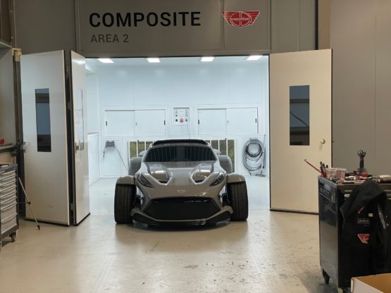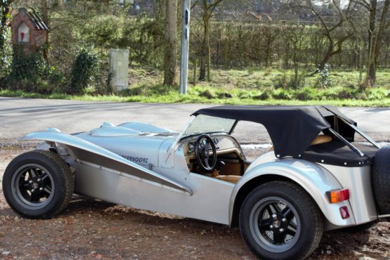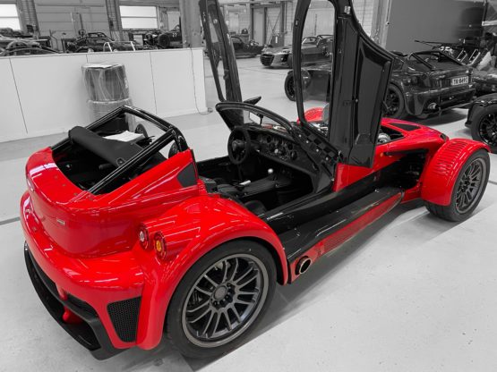

Have you ever wondered why a Donkervoort is so much better looking than every other creation of ‘the Super Seven family’? The answer can be found in it’s proportions and dimensions which are all created according to the rules of the golden ratio. It is responsible for symmetry, super symmetry and fractals. A design communicates not only that a product is innovative – it says the same about the entire company. The brand’s core values are communicated very effectively in the designs. That’s why the shape, with its long bonnet, alludes to archetypal racing cars.
More background info and explanation can be found on Wikipedia.
 When the Donkervoort was created, Joop Donkervoort has been thinking a lot about how to create a beautiful shape which we know as the Donkervoort. A car which is astonishing from every angle to look at. That was not easy, because “Beauty is in the eye of the beholder” as they say.
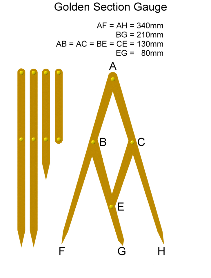
If you use a golden ratio gauge and measure dimensions on the Donkervoort such as the windscreen, length of the nose cone versus the length of the interior and the length of the bonnet versus the nose cone; they all are designed according to the golden ratio rules.
The same goes for the mirrors, head rests, rims, louvres in the bonnet etc. It’s an unwritten rule that if a product looks good, it often performs beautifully too.
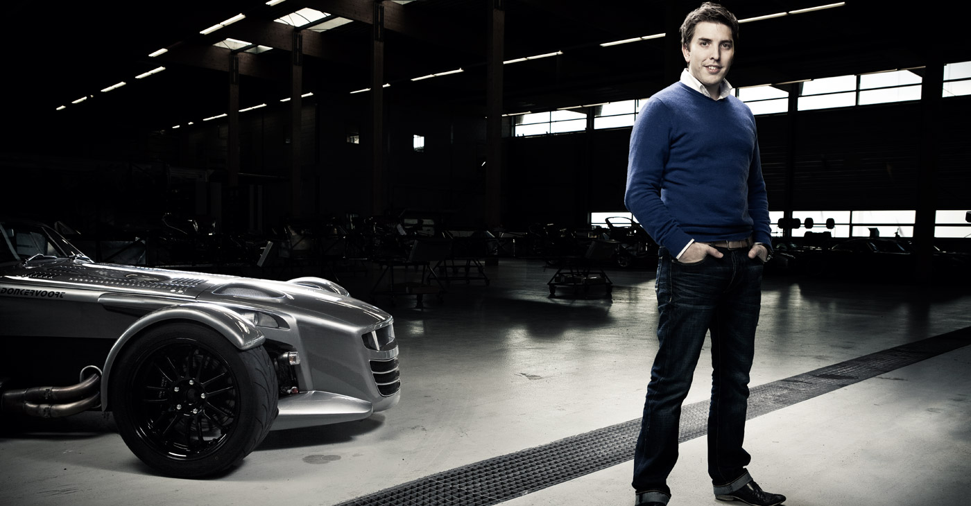
Jordi Wiersma, Designer of the D8 GTO
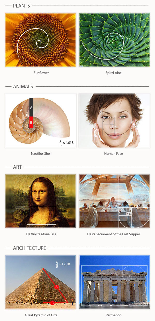
Here are some more samples of the golden ratio. Click to enlarge.